Introduction
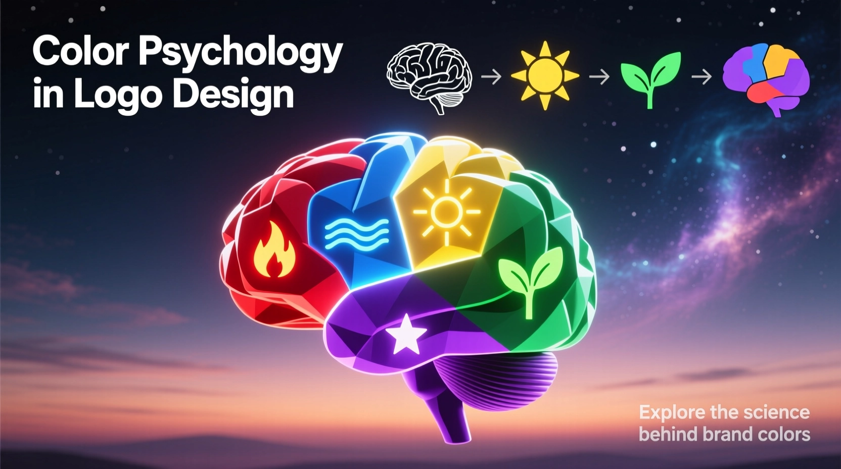
Let's be honest, color isn't just about making things look pretty. It's a powerful tool that can speed up decision-making. Think about it—when you see a logo, the color is the first thing that hits you. It can tell you if a brand is innovative, trustworthy, fun, or luxurious. So, choosing a color isn't about your personal favorite; it's about finding the perfect match for your brand's personality and the people you're trying to reach.
In this guide, we're going to break down how color plays with our emotions and attention, what different shades really mean, and how you can build a color palette that actually works. Plus, we'll show you how to test it so it looks great for everyone, everywhere.
How Color Influences Perception
Attention
Bright, bold colors just naturally grab our eye first. It's why a strategically saturated logo can stand out, even when it's tiny on a phone screen.
Emotion
Colors have a sneaky way of making us feel things. A warm red can get your heart pumping with excitement, while a cool blue can instantly make you feel calm and secure—all before you even notice the shape of the logo.
Association
Over time, we build strong connections between colors and ideas. Green means nature or money, blue screams tech and trust. You can play into these associations, or you can cleverly break the rules to stand out.
Color Meanings & Use-Cases
Warm Hues
- Red: It's all about passion, excitement, and urgency. You'll see it everywhere in food and entertainment, but maybe think twice for a financial app unless you're signaling an alert.
- Orange: This one just feels friendly and full of energy. It's fantastic for brands that want to feel approachable, like small business tools or a kids' event platform. Just watch out, as it can sometimes feel a bit less high-end.
- Yellow: The color of sunshine and optimism. It's a great pick for startups wanting to feel innovative, but you've got to make sure it's got enough contrast so people can actually read it.
Cool Hues
- Blue: The king of trust and calm. It's a safe bet for tech and finance, which is why it's everywhere. To stand out, you'll need to play with the shade or add a surprising accent color.
- Green: It just screams growth and nature. You can't go wrong with it for eco-brands or finance. A zesty lime green feels fresh, while a deep teal feels rock-solid.
- Purple: This one's for the creatives and the luxurious. It’s got this vibe of imagination and royalty. Deeper purples feel expensive, while lighter lavenders are more playful.
Neutrals & Monochrome
- Black: It's powerful, elegant, and minimal. Perfect for a luxury fashion label or a sleek tech gadget. Just make sure your design is still crisp when it's printed small.
- White: The hero of negative space. It creates clarity and breathing room. Always think about how your logo will look when it's reversed out on a dark background.
- Gray: The ultimate supporting actor. It adds balance and a mature feel without shouting. Use it to tone down a busy design.
Industry Quick Matches
- Fintech: Blue or Green (you want trust and a hint of prosperity)
- Food & Beverage: Reds, Oranges, Yellows (they literally wake up your appetite)
- Wellness/Healthcare: Blues and Teals (calm and clean, just what the doctor ordered)
- Eco/Outdoors: Greens and Earthy Tones (it's a no-brainer)
- Luxury: Black, Deep Purple, Gold (it just feels expensive)
Building a Strategic Palette
Define the Brand Role of Color
Before you pick a single swatch, write down your goal. Something like, “Our color needs to make us feel confident and friendly in a pretty conservative industry.” This one sentence will guide every choice you make.
Pick a Distinct Primary
Choose one hero color that fits your brand's promise. But here's the kicker—it also has to look different from your competitors. Don't be just another blue tech company. Tweak the saturation or temperature until it's uniquely yours.
Add Support Colors with Jobs
Give every other color a specific job. This one's for buttons, that one's for backgrounds. Don't go overboard—too many colors and your brand starts to feel messy and confused.
Codify Tones & Formats
Lock it all down. Write the HEX, RGB, CMYK, and Pantone codes. Decide on light and dark versions. This is the boring but crucial part that keeps your brand looking consistent from a business card to a billboard.
Pro Tip
A quick test? Plop your logo on a white, a black, and a gray background. If it doesn't hold up and look good on all three, you probably need to bump up the contrast or design a separate version.
Accessibility & Contrast
Contrast Benchmarks
- Shoot for a 4.5:1 contrast ratio for text in your logo; 3:1 is okay for bigger text.
- Always have an alternate version (like an outline) ready for dark mode.
- Test it on photos and gradients too—that's where things often go wrong.
Color-Blind Safe Choices
- Use more than just color to stand out—vary the lightness or add patterns.
- Try to avoid red and green as your only two colors; it's a common pitfall.
- A solid black and white version is a lifesaver and often looks super stylish.
Cultural Context
This is a big one. A color that means joy in one country might mean mourning in another. If your brand has global ambitions (or even just a diverse local audience), you've got to do your homework.
Your Cultural Checklist
- • Look up what your top target markets think about your chosen colors.
- • See what your competitors are using in those regions—you don't want to accidentally copy anyone.
- • Have a backup palette ready to go if your main colors don't translate well.
Testing & Validation
Don't just guess—test your colors with real people. Here's how:
Perception Tests
- The 5-second test: Show someone your logo and ask for the first three words that pop into their head.
- A/B test different accent colors on a button to see which one gets more clicks.
- Put your logo next to a competitor's. Does it stand out, or does it blend in?
Technical Tests
- Print it out! Colors on screen can look totally different on paper.
- Flip your website to dark mode. Does your logo still have the same punch?
- Squint at your favicon. Can you still tell what it is at 16x16 pixels?
Take all this feedback and put it in your brand guidelines. A simple "do this, don't do that" section will save your team a ton of headaches later on.
Common Mistakes
Choosing Color Before Strategy
Picking a color just because you like it is a classic mistake. You might end up with a calming lavender for an extreme sports brand. Start with your strategy, then pick the color.
Too Many Colors
It's tempting to use all the colors, but a rainbow logo is hard to remember and a nightmare to print. Stick to one main color and one or two accents.
Ignoring Contrast & Accessibility
That light gray on white might look minimalist and cool on your fancy monitor, but it's completely invisible on a cheap phone in the sun. Always test for readability.
Cultural Blind Spots
Using a color that has a negative meaning in your biggest market is a costly error. A little research now can save a rebrand later.
Conclusion
At the end of the day, color is one of the most powerful tools in your logo design kit. Get it right, and it communicates your brand's soul in a split second, makes you more memorable, and just works better everywhere.
So, remember the process: start with your strategy, choose a primary color that's both meaningful and unique, build a simple supporting palette, and then test, test, test. Do all that, and your color won't just be a decoration—it'll be a core part of your identity.
The best brand colors feel inevitable—like they were the only possible choice all along.