So, What's Shaping Logos in 2025?
Let's be honest, logo design isn't slowing down. As we cruise through 2025, it feels like everything is evolving faster than ever. It's not just about a cool static mark anymore—brands need a living, breathing identity that can adapt on the fly while still being instantly recognizable.
Think about it: the line between our digital and physical worlds has pretty much vanished. Your logo has to work just as well on a smartwatch as it does on a billboard, and maybe even in an AR filter. And the data backs this up—brands that keep their visual identity fresh see a whopping 42% higher recall. It's not about changing for the sake of it, but about staying relevant.
Adaptive Color Systems
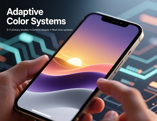
Remember when a brand had one or two signature colors? Those days are fading. We're now seeing static color palettes being swapped out for adaptive systems that shift and change based on context. Imagine a logo that subtly shifts its hue with the time of day, or reacts to a user's interaction. It's all about staying recognizable while feeling alive and relevant to the moment.
The smartest brands are building systems with a core set of 5-7 primary shades that can automatically adjust for things like background contrast or even real-time data. It’s a small change that makes a brand feel incredibly responsive.
Why This is So Powerful:
- Context is King: Your colors actually make sense in different environments.
- Emotional Depth: A color shift can instantly communicate a new campaign or mood.
- No More Squinting: Automatic contrast adjustment is a win for accessibility.
- Always Fresh: You can introduce seasonal vibes without a full rebrand.
AI-Enhanced Design
Generative Variations
AI is fantastic for smashing through creative block. It can churn out thousands of variations based on your core ideas, letting you explore directions you might not have considered.
Predictive Testing
Why guess? Machine learning can analyze mountains of design data to give you a solid prediction on how a logo might perform before you even present it.
Performance Analytics
Once a logo is out in the wild, AI tools can track engagement across platforms, showing you what's working and what might need a tweak.
Let's get one thing straight: AI isn't here to steal our jobs. It's becoming a powerful co-pilot. The real magic happens when designers use these tools to analyze trends and test ideas at a scale that was once impossible, freeing us up to focus on the big-picture strategy and the emotional core of a brand.
My Two Cents
AI can give you a thousand options in a minute, but it can't tell you which one tells the right story. That gut feeling, that spark of human intuition? That's still the most valuable tool in the box.
Responsive Logos
The one-size-fits-all logo is officially a relic. In 2025, if your logo doesn't flex and adapt, it's going to look out of place. We're building entire systems now—logos that intelligently simplify or elaborate based on whether they're on a favicon or a full-scale billboard.
Favicon (16px)
Mobile App Icon
Website Header
Print Materials
Think in Layers: The Responsive Hierarchy
- The Emblem: Just the icon for those tiny, precious spaces.
- The Compact: Icon + a word or two for mobile navigation.
- The Standard: Your full, primary logo for most digital uses.
- The Formal: The extended version with a tagline for print.
- The Performer: The animated version for video and digital ads.
Abstract Minimalism
Minimalism is still king, but it's getting a bit more... abstract. Instead of a literal apple or a bird, we're seeing brands embrace geometric forms and clever negative space that *suggest* an idea rather than shouting it. It’s a more sophisticated, almost poetic approach.
The beauty here is that it creates a little mystery. A logo that reveals its meaning over time as a customer engages with the brand? That builds a much deeper connection than something that explains everything at first glance.
Why Abstract Minimalism is So Effective:
- It Sticks in Your Mind: Unique shapes cut through the visual noise.
- Incredibly Flexible: An abstract form isn't tied to one industry.
- Layered Meaning: It lets your audience discover the story.
- Built to Last: Less tied to fleeting trends, more likely to feel timeless.
- Easy to Work With: A simple shape is a dream to animate and adapt.
Animated Identity
Static is, well, a bit boring. Logos are coming to life with subtle animations and micro-interactions that do more than just look pretty—they communicate personality and guide the user experience. A little bit of motion can make a brand feel friendly, sophisticated, or energetic.
The Spectrum of Motion:
- Subtle A gentle pulse on hover, or a smooth transition. It's all about feel.
- Moderate A continuous, looping animation for a social media profile picture.
- Expressive A full-blown animation for a video intro or a special campaign.
- Functional A loading animation that tells you something is happening.
Keep It Smart:
- Don't Bog Down the Site: Optimize, optimize, optimize. SVG is your friend.
- Be Kind to Everyone: Always provide a reduced-motion option for accessibility.
- Stay on Brand: The core logo should be recognizable in every single frame.
- Performance Matters: If it stutters, it looks cheap. Smooth is key.
Sustainable Aesthetics
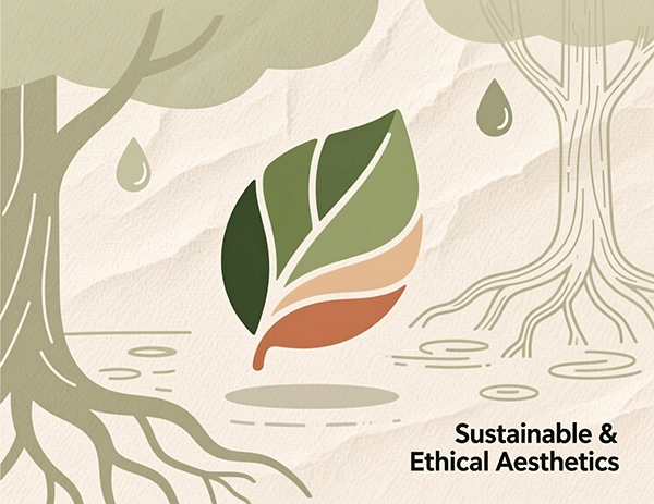
Consumers are smarter than ever, and they care about where a brand stands. This is showing up in logos through organic, flowing shapes and color palettes pulled straight from nature. It’s a visual way of saying, "We're mindful of our impact."
This goes beyond aesthetics. It's about designing with intention—creating marks that are simple and efficient, using less ink in print and less energy on screens. It’s design that feels good because it *does* good.
Organic Shapes
Imperfect, flowing lines that feel natural and hand-crafted, not machine-made.
Earth Palette
Think rich terracotta, calming sage, warm sand, and deep forest greens.
Minimal Impact
Designing for efficiency—less ink, less data, less waste. It just makes sense.
Typography Evolution
Wordmarks aren't going anywhere, but my goodness, are they getting interesting. We're moving beyond just picking a nice font from a catalog. The real excitement is in custom letterforms, variable fonts, and typography that has real personality and depth.
What's Driving the Typography Revolution:
Variable Fonts are a Game-Changer
One font file that can be skinny, wide, bold, or light on command? It's like responsive design for your type, and it's absolutely brilliant for dynamic interfaces.
Bespoke Lettering
Tweaking a single character or crafting a completely custom alphabet is the ultimate way to own your brand's voice. It’s your signature, literally.
Type with Texture
Adding a sense of depth, grain, or even a subtle material feel to letterforms makes them pop off the screen while keeping them perfectly readable.
Wrapping Up
So, what's the big takeaway from all this? Logo design in 2025 is less about a single, perfect mark and more about building a smart, flexible visual system. Your brand's identity needs to be a chameleon—able to adapt to any situation without ever losing its core self.
Technology is giving us incredible new tools, but the heart of a great logo hasn't changed. It still needs to be clear, memorable, and connect with people on an emotional level. The winners will be the brands that master this balance between high-tech innovation and timeless human truth.
As you think about your own brand's look, focus on building a system, not just a logo. Ask yourself: How will this work on a smartwatch? What does it feel like in motion? Does it represent our values? The future belongs to brands that are built to adapt, all while staying unshakably true to who they are.