Introduction
Think about the last time you saw a logo that just clicked with you. It wasn't just a random image, was it? That's because a good logo works as a mental shortcut—it tells people what to expect from your brand before they even read a single word. When it's right, it builds trust and connection. When it's off, well, it creates doubt or just gets ignored entirely.
In this article, we're going to look at how logos actually shape how people see your brand. We'll explore the psychology behind why certain logos work better than others, how color and shape influence emotions, and most importantly, how you can tell if your logo is actually doing its job.
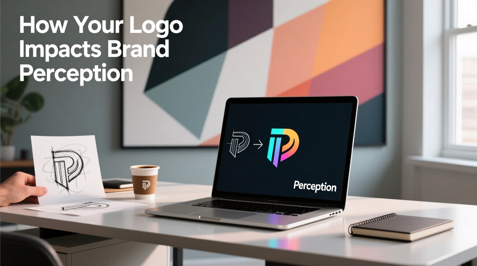
What Is Brand Perception?
Brand perception is basically the sum of all thoughts, feelings, and expectations people have about your company. It's built through every interaction they have with you—from your products and customer service to your tone of voice and, of course, your logo. Since logos are often the first thing people notice and see repeatedly, they act like a signature that sets the stage for everything else.
Expectation Framing
Your logo primes people to expect certain qualities—whether that's premium, playful, or efficient—before they even interact with you.
Memory Cue
A distinctive logo helps people remember your brand when they're making buying decisions.
Trust Signal
Clean, professional design suggests competence, while sloppy work suggests the opposite.
The Psychology of Logos
Logos work through several mental shortcuts our brains naturally take:
- Mere-Exposure: The more we see something, the more we tend to like it—so consistency really matters.
- Processing Fluency: Simple, clear designs feel easier to understand and are often seen as more trustworthy.
- Semiotics: Shapes and symbols carry meanings we've learned over time (think shields for protection or arrows for movement).
- Affect Heuristics: Colors and forms trigger emotions that influence how we judge products.
The bottom line: a logo isn't magic—it's a system of cues. When those cues align with what your brand actually offers, your brand perception gets stronger.
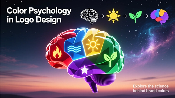
Color, Shape & Typography
Color
Colors really do affect how we feel, though meanings can vary across cultures. Some common associations:
- • Blue: trust, reliability—common in tech and finance
- • Green: growth, nature, eco-friendly
- • Red: energy, urgency—great for food and action
- • Black: luxury, authority, simplicity
Quick tip: test your colors on different backgrounds and in black and white to make sure they still work.
Shape Language
Forms suggest personality traits:
- • Circles/ovals: warmth, community, harmony
- • Squares/rectangles: stability, structure, reliability
- • Triangles/arrows: motion, innovation, progress
- • Organic forms: human, playful, artisanal
Be careful with shapes that might send the wrong message—like fragile-looking forms for a security company.
Typography
Fonts communicate tone immediately:
- • Serif: heritage, editorial, academic
- • Sans-serif: modern, accessible, digital-first
- • Geometric: precision, tech-forward
- • Humanist: friendly, approachable
Remember: if people can't read it easily, it won't build trust.
Quick Alignment Check
- ✔ Does your logo's tone match what you offer and who you're talking to?
- ✔ Can people describe it in a few words after just a quick glance?
- ✔ Does it stand out from competitors without looking gimmicky?
- ✔ Will it work in different sizes and contexts—from app icons to dark mode?
Consistency & Context
Perception builds up over time. Your logo earns its meaning through consistent use across all the places people encounter your brand—packaging, websites, ads, emails, and social media. When you're inconsistent, people get confused and trust erodes.
Implementation Guidelines
- • Set clear minimum sizes and spacing rules.
- • Create versions for different layouts—horizontal, stacked, and icon-only.
- • Prepare light, dark, and single-color versions.
- • Show examples of what not to do to prevent misuse.
Digital Realities
- • Make sure it works tiny—like in favicons and notifications.
- • Test how it looks in both light and dark modes.
- • Consider how it might animate if needed.
Measuring Perception
Don't just guess—find out for sure. Use a mix of methods to see if your logo is creating the right impressions and driving the behavior you want.
Qualitative Approaches
- One-on-one interviews: Ask "What three words come to mind?" or "What kind of company is this?"
- Association tests: See how quickly people connect your logo with certain adjectives.
- Competitive positioning: Place your logo alongside competitors and see how people perceive it.
Quantitative Methods
- A/B testing: Compare different logo versions to see which performs better.
- Recall tests: Show your logo briefly and see what people remember.
- Brand surveys: Measure changes in trust and perception before and after introducing a new logo.
Signs You're On The Right Track
- • People use the words you want them to when describing your brand.
- • They recognize and remember your logo more easily.
- • Your key business metrics don't drop after a logo change.
Pitfalls to Avoid
Misaligned Signals
A playful logo for a serious business (or vice versa) creates confusion and slows down trust building.
Over-Complexity
Busy logos are hard to process and remember—especially on small screens where simplicity matters most.
Inconsistency
Using your logo differently across channels makes your brand feel scattered and unreliable.
Unvalidated Assumptions
Skipping audience testing means you might be designing for yourself rather than your customers.
Refresh vs. Rebrand
Choose a Refresh When…
- • People recognize your logo but it's getting dated or hard to read.
- • You need it to work better on digital platforms and small screens.
- • Minor tweaks would fix consistency issues.
Choose a Rebrand When…
- • Your business, audience, or market has fundamentally changed.
- • Your current logo has negative associations.
- • You need a complete reset to reposition in the market.
Decision Framework
- Define the key attributes you want people to associate with your brand.
- Assess how people currently perceive your logo.
- Identify what elements of recognition you can't afford to lose.
- Explore different approaches—refresh, hybrid, or full rebrand.
- Test your ideas before making a final decision.
Conclusion
Your logo is a powerful tool for shaping how people feel about your brand. Through thoughtful use of color, shape, and typography—applied consistently across all touchpoints—you can create the perceptions that build trust, recognition, and loyalty.
Think of your logo as part of a larger system: make sure its cues align with your brand promise, test what people actually perceive, and make changes deliberately. Do this well, and your logo becomes more than just a graphic—it becomes a valuable asset that supports your growth.
Perception follows signals. Design the signals on purpose.