Let's Talk About Making a Logo That Sticks
These days, just having a logo isn't the goal. You need one that people actually remember. Think about it—we're all bombarded with thousands of brand messages daily. In that sea of noise, your logo has a split second to make an impression.
So, how do the big brands do it? It's not magic. They use principles from psychology and neuroscience to engineer memorability. And it pays off. A logo that sticks can seriously boost brand recognition and even let you charge a bit more.
Why Bother? The Memorability Advantage
- 7x higher recall: Memorable logos are recalled 7 times more often than average ones.
- 34% purchase intent: People are more likely to buy from a brand they remember.
- 2.5x word-of-mouth: A cool, memorable logo gets people talking.
- 18% price premium: Strong branding can justify higher prices.
The Simplicity Principle
A clean, simple logo for a tech company, made with Logonaut.
Our brains are lazy. They love things that are easy to process. That's what "cognitive load theory" is all about—simple logos don't make people work hard, so they're easier to remember.
MIT research backs this up, showing that simple logos are remembered 68% better after just a quick glance. The trick is to boil your brand down to one powerful idea.
Keep It Simple Checklist:
- One focal point: What's the first thing you see? There should be one clear answer.
- Limited elements: Stick to 2-3 core components. Don't get carried away.
- Scalability: If it turns into a blurry mess as a favicon, it's too complex.
- Quick comprehension: People should "get it" in under three seconds.
"Look at the Nike swoosh. No words, no fancy details. Just a simple checkmark that everyone knows. That's the power of simplicity."
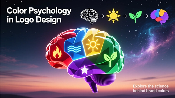
Color Psychology
Color is your secret weapon. It can boost brand recognition by a huge margin and makes your logo way more memorable than a black-and-white version. Different colors pull at different emotional strings, whether we realize it or not.
An energy drink logo using red-orange to scream 'excitement', made with Logonaut.
| Color | The Vibe It Gives | Works Great For |
|---|---|---|
|
Red
|
Energy, excitement, a sense of urgency | Food, entertainment, sales |
|
Blue
|
Trust, security, professionalism | Banks, tech companies, healthcare |
|
Green
|
Growth, health, nature | Eco-friendly brands, finance, wellness |
|
Purple
|
Luxury, creativity, a touch of mystery | Beauty brands, art, spiritual businesses |
|
Orange
|
Fun, enthusiasm, friendliness | Youth brands, home goods, call-to-action buttons |
The Vibe It Gives: Energy, excitement, a sense of urgency
Works Great For: Food, entertainment, sales
The Vibe It Gives: Trust, security, professionalism
Works Great For: Banks, tech companies, healthcare
The Vibe It Gives: Growth, health, nature
Works Great For: Eco-friendly brands, finance, wellness
The Vibe It Gives: Luxury, creativity, a touch of mystery
Works Great For: Beauty brands, art, spiritual businesses
The Vibe It Gives: Fun, enthusiasm, friendliness
Works Great For: Youth brands, home goods, call-to-action buttons
A Few Tips on Picking Colors:
- Think about your industry: A bright orange might be great for a kids' brand but weird for a law firm.
- Contrast is key: High-contrast colors (think blue and orange) are easier to see and remember.
- Mind the culture: Colors mean different things in different parts of the world.
- Feel it out: Choose colors that actually make people feel the way you want them to feel about your brand.
Shape Symbolism
It's kind of wild, but our brains have instinctive reactions to basic shapes. Circles feel one way, squares another. Using that to your advantage is a smart move.
Circles & Ovals
These feel like unity, community, and protection. They're warm, inclusive, and have a feminine energy.
Squares & Rectangles
All about stability, order, and reliability. They scream "professional" and "trustworthy." You see these everywhere in finance and tech.
Triangles & Points
These suggest direction, power, and progression. They can feel scientific, or even a little aggressive, depending on how you use them.
A Quick Thought
"Starbucks didn't pick a circle by accident. That shape makes you think of community and hanging out—perfect for a coffee shop. The mermaid inside? That just adds a bit of mystery."
Negative Space Magic
A clever use of negative space to hide a secondary image.
This is one of my favorites. When someone suddenly spots the hidden arrow in the FedEx logo or the bear in Toblerone, their brain gets a little hit of dopamine. That "aha!" moment makes the logo incredibly sticky.
Logos that use negative space well are remembered almost 50% better. Plus, people love sharing them online—it feels like an inside joke.
Some Classic Examples:
-
FedEx: That famous arrow between the 'E' and 'x' is pure genius.
-
Toblerone: Look at the mountain—there's a bear hidden in there, a nod to the city of Bern.
How to Do It Right:
- Keep it subtle: It should be a fun discovery, not immediately obvious.
- Make it meaningful: The hidden thing should actually relate to your brand.
- One trick is enough: Don't try to cram multiple hidden images in.
The Von Restorff Effect
This is a fancy name for a simple idea: in a crowd of similar things, the one that's different is the one you remember. For your logo, it means breaking the pattern in one clever way.
Everything looks the same. Pretty boring, right?
One different color? Now you're looking.
One different shape? Even better.
Look at Google
Google's logo is a masterclass in this. All the letters are lowercase and colorful, but the second 'o' is yellow instead of red. It's a tiny break in the pattern that makes the whole thing unforgettable.
Storytelling Elements
We're wired for stories. If your logo can tell a tiny one—even an abstract one—it becomes more than just a picture. It becomes a conversation starter.
What Kind of Story Can a Logo Tell?
-
Origin Story: Like Amazon's arrow that goes from A to Z, saying "we have everything."
-
Value Story: Patagonia's mountain isn't just a mountain; it's about the love for the outdoors.
-
Customer Story: A logo that shows the benefit or transformation a customer gets.
A logo that hints at growth and moving forward, made with Logonaut.
Cognitive Fluency
This just means "how easy is this to get?" Logos that are easy on the brain feel more true, more beautiful, and are way easier to remember. If people have to work to understand your logo, you've already lost them.
It's a Real Thing
There was a study that found stocks with easy-to-pronounce names actually performed better. The same logic applies to your logo. Easy processing creates positive feelings.
How to Make a "Fluid" Logo:
-
Clear as day: It should be understood in a single glance.
-
Not too busy: Fewer elements = less work for the brain.
-
Friendly curves: Rounded shapes are actually processed faster than sharp, pointy ones.
A logo designed for easy-breezy brain processing, made with Logonaut.
Emotional Resonance
A pretty logo gets a glance. A logo that makes you feel something gets remembered. Neuroscience shows that emotions are like superglue for memories.
Love & Connection
Warm colors and soft, round shapes make people feel included and cared for.
Trust & Security
Solid shapes and cool blues say "we're reliable and we've got your back."
Energy & Excitement
Bold colors and dynamic shapes feel like movement, fun, and enthusiasm.
How to Add Emotional Depth:
- Figure out your personality: Are you playful? Sophisticated? Reliable?
- Pick elements that match: Choose colors and shapes that express that feeling.
- Test it on real people: Show your logo to friends or potential customers and ask them how it makes them feel. Their first impression is usually the right one.
Consistency & Repetition
You can have the world's best logo, but if no one sees it enough, they'll forget it. There's a psychological trick called the "mere exposure effect"—we start to like things just because we see them a lot. Familiarity breeds... memorability.
How Many Times Until They Remember?
Using the same logo everywhere, made with Logonaut.
Testing & Optimization
Don't just guess if your logo works. Test it. A little bit of data can save you from a big mistake and show you exactly what's sticking in people's minds.
Simple Ways to Test Your Logo:
The "Can You Find Me?" Test
Show your logo mixed in with a bunch of others. Can people pick yours out? If so, that's a great sign.
The "What Was It?" Test
Flash your logo for a few seconds, then take it away. Ask people to draw it or describe it. This tells you what parts are truly memorable.
The "Vibe Check"
Ask people what words, feelings, or ideas the logo brings to mind. You want their answers to line up with what your brand is all about.
Real-World Examples
Here's how these principles come together in some logos made on our platform. Notice how each one uses a few strategies at once.
EcoCycle Solutions
Sustainable packaging
TechNest Labs
A technology incubator
Bloom Boutique
A luxury fashion retailer
Peak Performance
A fitness coaching service
Wrapping It Up
At the end of the day, a memorable logo isn't about chasing the latest design trend. It's about understanding a bit of brain science. It's about creating a mark that's easy to process, nice to look at, and makes people feel something.
You don't need to use all ten strategies at once. Start with a dead-simple foundation. Then, think about color and shape. See if you can weave in a little story or a clever hidden element. The goal is to create a logo that doesn't just get seen—it gets remembered.
Think about the logos you never forget—the Nike swoosh, the Apple apple. They weren't created by accident. They were built on these principles. Your logo can be too. Keep it simple, make it mean something, and be consistent. That's how you create a mark that sticks.